Thursday, October 30, 2014

Update/Repost Stamp Cataloging and Organization

My update is in blue at the bottom, but here is where I began this journey...

I’m so happy that I have completed my two identical stamp catalogs (one for home and one for taking on the road to make sure I buy with intention – no duplicates, items that are too similar or things I don’t really need). It has taken me MONTHS to catalog hundreds and hundreds of stamps into the 3 section system taught by Tiffany Spaulding at the Scrap Rack. My first post detailing the specifics on how I started this journey can be found here. The reasons it took me so long are the amount of stamps I have and the amount of times I had to renumber because I had already used those numbers. Word to the wise, number all your stamps first then you don't have to wonder like I do. And when you stop, leave yourself a note so you can easily pick up where you left off.

In time, I found my groove and chugged along little by little until it was complete. Now I can find what I have, use it more efficiently and it feels SO good! When I get new stamps I know before I get home which categories to place it in and have a clear process for adding it to my catalogs.

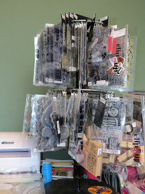
I thought I'd share some pics of where I keep my massive stamp collection. It's a work in progress.


I have one drawer of stampin up wheels and Inkadinkado stamping gear and other stamp accessories.


This box with magnetic closure has my stampin' up stamps. I put 2 sets in one case and use the empties for other companies' stamps.


This case has 2 layers of wood block stamps in an Art Bin case. Here's the top view.


Here's the bottom view. A piece of chipboard separates the 2 layers.


I have a second Art Bin that is double deep. Chaos lives within. No rhyme or reason here.


My clear stamps are in the clip it up divided by the 4-section system taught by Tiffany Spaulding at the Scrap Rack.


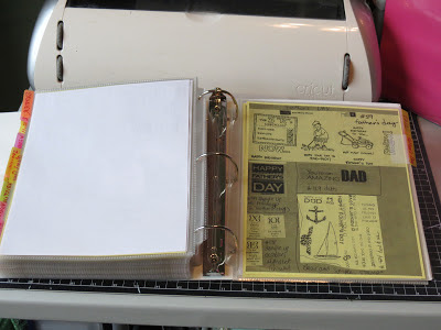
Here is the 2 volume unmounted stamps I own. It's divided by the 4-section system taught by Tiffany Spaulding at the Scrap Rack as well.

I made a video of the pages of my stamp catalog but it will not upload. I may have to make 2 shorter videos. Then I'll post it and a look at what's in my Scrap Rack by section.


This post debuted in March 2013 but here's a bit of an update. My stamp cataloging is an ongoing process because I buy stamps often and because I am still searching for organization nirvana. I decided that a catalog by manufacturer was very valuable to me since I tend to collect lots of certain manufacturers and could find things easier. 

I have long abandoned my themed catalog and while it is very useful, it's a pain in the butt for someone that has 1000s of stamps. I still suggest it for folks that don't have a huge collection though. Instead I typed all my sets into excel so I can search by category, number, manufacturer etc.

I found that I had given the same numbers to many stamps and have skipped hundreds of numbers. UGH! So I have been renumbering, noting the numbers that are not yet used and reorganizing. I keep my stamps in four areas - a bookshelf, two three ring binders, a gray pull out bin and a 3 drawer rolling sterilite. I am able to find what I need now. 


If you'd like to see where I started and the things I learned along the way, check out:


La-Vie

Tuesday, October 28, 2014

Update and Repost - Embossing Folder Storage Nirvana!

First posted in February of 2013 - This question is a hot topic always. I thought I would re-post.

Please leave me your comments and questions below. How are you storing your folders? How are you cataloging them so you can find the right one for your projects easily?

I have long since outgrown the shoe boxes. I currently store mine in 2 large organizers from Close to My Heart (CTMH). I got them from my CTMH rep Cardmonkey Jarvis and I have linked to her site above. They are full and do not fit any of my border folders which are in a large zip lock bag on my cubby style bookshelf.

*********************************************************************************

You may be familiar with my first post about embossing folder storage. This is the long-awaited sequel!! Since my original post, I have collected many more folders from several companies and a new cartridge that makes this storage solution SO much easier. I'm so excited I thought I'd share the info.

To store my embossing folders I create a tabbed file folder that I emboss with the folder's design. It allows me to see the design embossed and debossed as well as find specific folders at a glance. Using the Cricut cartridge Fabulous Finds, pg 131, blackout - there is a middle tab and using shift you can access the right tab.


As my collection grew, I didn't notice the differences in sizes for the embossing folders from one company to another. Here's the low down...
  • Cuttlebug A2, The Paper Studio -  4.25" x 5.75"
  • Darice - 4.5" x 6.25"
  • Newer cuttlebug and Anna Griffin - 4.75" x 6"
  • Indentz - 4.75" x 6.75"
  • Sizzix (regular) and Tim Holtz - 4 7/8" x 6"
  • Sizzix - 4 7/8" x 6.75"
  • Cuttlebug - 5" x 7"
  • Anna Griffin - 5.5" x 7.5"
4.25" x 5.75" and 4.5" x 6.25"
4.75" x 6"  and 4 7/8" x 6"


4.75" x 6.75" and 4 7/8" x 6.75"


5"x7"


5.5" x 7.5"


When making the folders keep these tips in mind. You can create a left tab by folding the (right tab) folder the opposite way. If your cardstock is patterned, be sure to place the patterned side face down on the mat to make a left tab and face up to make a right tab. Use cardstock heavy enough to hold the embossing (paper or linen cardstock won't work) but not too thick that it won't fold down neatly. I used beige cardstock for my A2 folders because I had a lot of it and barely use it. You can also use cardstock from your purge box or ones with designs you do not prefer. As long as one side is both smooth and one solid color. The cardstock shouldn't even have a subtle design in the paper or the embossing will not come out as well. Cut in the direction of the grain of the paper of you will experience a lot of cracking in the embossed design.

I used the E2 Cricut to cut the folders. REAL DIAL SIZE ON! Here's the sizes:


  • Cuttlebug A2, The Paper Studio, Darice  -  6.50
  • Newer cuttlebug, Anna Griffin, Sizzix (regular) and Tim Holtz - 6.75
  • Indentz, Sizzix - 7.00
  • Cuttlebug - 7.50
  • Newer cuttlebug, Anna Griffin - 7.75

  • When you cut the folders they come out with score marks. I hand fold mine anyway to save time but always flatten the fold with a bone folder. Use your embossing machine - I am using my Anna Griffin cuttlebug and the eBosser - to emboss the front of the folder only. Be sure to write the names/set with a sharpie somewhere on the folder as well as label the cardstock folder. When the set has a name but the individual folders do not, I called it "set name (1 of 4)." All my folders have the name of it written on the front with a sharpie. Here's a look at a completed folder.


    Next, I sorted the folders into the 4-section organization system I learned from Tiffany Spaulding at The Scrap Rack.  Her free organization seminars run year round. It's the best hour I spent each week learning to get more use out of all these supplies I hoard. First step is admitting you have a problem (my hand is raised LOL!) The folders live in 2 photo storage boxes that are shoe box size. I am working on typing in the labels (return address labels) to include the folder name, code for the manufacturer and the section it belongs in.  For example, here's one of my labels:

    Honeycomb (TH)(Backgrounds)

    The folder name is honeycomb by Tim Holtz (TH) and it is supposed to be stored in Backgrounds. I am not yet done with all my folder making or labelling but it's a work in progress.

    Hope this helped you get more organized!

    If you'd like to see where I started and the things I learned along the way, check out:


    La-Vie

    Sunday, October 26, 2014

    Repost - Why Detailed Embossing Powder is KING!!


    This is another questions I get a lot so I figured I would repost information on why Detailed Embossing Powder is King for embossing words and fine details. I recommend Ranger fine detail embossing powders as well as Stampendous and Sparkle 'n Sprinkle.

    *****************************************************************************

    Today I'm sharing tips about heat embossing and choosing the right kind of embossing powder for your projects. If you haven't heard, there's several kinds of embossing powder on the market. Today I am going to explain the difference between detailed and regular embossing powder.

    I'll share tips on embossing the smallest script sentiments and the most detailed stamps. I wish someone had told me about these tips when I first started heat embossing. I went out and bought a large pack of 15 colors thinking I was "doing something." Since then, I haven't used the technique much because my results would often ruin my finished projects. I loved the thought and look of heat embossing but something was just a bit off. Well, never fear!! I've got your back. This tutorial should help make your heat embossed projects come out perfectly.

    1. Supplies needed to make your heat embossing work best include:


  • Darice stamp mat (mine is cut in half) - don't stamp anything without this!!

  • Embossing buddy (EK Success powder tool or a drier sheet)

  • VersaMark (or any watermark stamp pad) and VersaMarker (to correct an oops moments)

  • Get Inky! Stamps (of course) and a clear block

  • Embossing Powder

  • Heat Gun

  • Cardstock

  • NOT SHOWN - Embossing/glitter tray (shoe box top or a folded piece of copier paper to catch and return the embossing powder to its container)


  • 2.   Before doing anything, run the embossing buddy over the cardstock several times. That will coat it with powder disallowing the embossing powder to stick anywhere but where you want it to.


    3.   Ink the stamp and stamp the impression with the cardstock on top of the stamp mat. You will not be able to see the impression much since it's a watermark ink. Place the cardstock in the embossing tray and dump embossing powder on the stamped area. Some embossing powder will stick to the stamped area. Return the embossing powder that falls off back to its container and close the container.

    Here you can see an example of the Happy Kwanzaa stamp from the Get Inky! Stamps - 2013 Holiday Set (available at Etsy by clicking the link). It is a small skinny font. On the left is the detailed embossing powder. As you can see, you can barely see that it has embossing powder on it. it almost looks stamped because the grains are so fine. The normal embossing powder is a little more chunky and fuzzy. Furthermore, you can see areas where the powder has not stuck to stamped image.


    4.  Next step is to use a heat gun to heat the embossing powder until it melts. If it looks grainy then you need to heat it more. If the paper gets brown and burnt, you've heated too long. The color will change before your eyes. It will turn from a powder to a liquid and takes a matter of seconds. You may want to use tweezers to keep my cardstock from moving around on the table. But make sure your cardstock is flat on the table during the heating process.

    Here's the results! The detailed embossing powder created an even, shiny, beautifully embossed sentiment even though the font is small and skinny. The regular embossing powder created more of a spotty, messy embossing of the font. It's more shiny and more puddled.

    Detailed embossing powder is made to pick up details in the stamps without puddling. Regular embossing powder is made to puddle and melt together to fill in the spaces. That's why it doesn't stick to every part of the stamped image. While detailed embossing powder works well on BOTH detailed stamps and non-detailed stamps, regular embossing powder is ONLY for larger non-detailed stamps.


    Here's some more examples from the 2013 Holiday Set. The top impression is made with regular embossing powder. Notice the lines are thicker and more puddled. The bottom impression is done with detailed embossing powder. The lines are thinner - exactly as the stamp was created - and the embossing stays in place and does not puddle at all.


    Here's two other views that exemplify the difference between the two embossing powders. Looks like I need to heat the middle "Ho" on the bottom some more. It's not fully melted! I love the fine lines in this stamp. It will really make wonderful Christmas crafts!


    Finally, I have 2 other examples to point out using stamps from the massive Buzzing Bees set. The beautiful script comes out best with detailed embossing powder. When you compare all the loops and holes in the font they are open with the detailed embossing powder and closed with the regular. While it still can be read, it's not as neat, clean and true to form as with the detailed embossing powder.


    There are may bees in this set so I chose a very hairy one to show you the difference. This one is harder to see but the hairs are thinner and more individual with the detailed embossing powder than with the regular. The eyes look clearer with the white dot being more visible as well. On the wing of the detailed embossing powdered bee, I didn't apply enough pressure so I used the VersaMarker to go in and add more watermark ink in the spot I missed. I was then able to reapply the embossing powder and heat everything together.


    I suggest using detailed embossing powder for all your embossing needs. I use Ranger super fine detail and Stampendous detail embossing powders. Also check out Ranger Embossing Powder Sticky to adhere glitter, foil, flocking. I hope this helps skyrocket your creativity!!

    If you have any questions, please leave it in the comments and I will do my best to answer them. If you'd like a new tutorial on the Ranger Embossing Powder Sticky, leave that in the comments as well!

    Until next time... now go Get Inky!!

    La-Vie

    Friday, October 24, 2014

    REPOST - Think Ink!! A Brief Ink Tutorial


    This post was first shown on my blog on 1/22/12. Fans have asked my opinion on inks lately. So I figure it would be helpful to re-share this post. I hope you find it helpful!

    *********************************************************************************

    Recently, a faithful blog follower asked me to share my thoughts about the inks I use and their various uses. I thought the information would benefit all of my followers so I have prepared a brief ink tutorial. I am still learning but here's a few pointers. I know I have not covered every kind of ink here or every variable. If you have info to add to the conversation, I welcome you to do so in the comments section.

    I find that choosing the right ink for a project depends on your project goals. Are you coloring in printed images, making a watercolor background, heat embossing and stamping, etc. If you know ahead of time what you want to achieve AND are familiar of the best inks to use to achieve those goals - you're in the best position possible.

    DYE INKS
    can be water-based such as Clearsnap Vivid! or solvent-based (waterproof) such as Ranger Archival inks
    • transparent - so it gives a fuzzy variation of color. light colors stamp like pastels, darker ones are bright and brilliant 
    • fast drying - so it's not good for heat embossing but great on glossy or coated papers
    • fades - water-based dye inks fade over time
    • watercolor effect - with water-based dye ink - apply ink from the pad with a wet brush or ink a stamp with various colors and spritz with water just before stamping, stamp an image and spritz the paper
    • stamped images can be colored - with pencils, chalk, anything that's not wet because water-based dye ink will run
    • Tim Holtz Distress Ink - water-based dye ink that behaves differently than normal. It stays wet longer and the colors mix well with water (instead of running) and other ink colors for that aged look
    • waterproof - after the initial image is stamped and dried, these dye inks don't run when re-wet. this works well if you stamp an outline of an animal and want to watercolor it or color in with markers etc.

    PIGMENT INKS
    oil-based, acid-free, thick versatile inks that can be slow drying - Ranger Adirondak or fast drying - Tsukineko Archival Brilliance
    • don't fade - a great choice for scrapbooking
    • dries slower - making it great for heat embossing, available in "clear" for embossing purposes
    • opaque - providing a bolder solid color
    • waterproof - can be watercolored once dry
    • great on coated papers -  glossy, photo, vellum etc. - if heat set
    • not good for non-porous surfaces - doesn't dry at all
    • Archival Brilliance - not good for heat embossing but works well on top of heat embossing for a layered scene effect and on glossy, photo, vellum etc. - if heat set

    CHALK INKS
    Ink that is created to give the look of chalk - muted and matte such as ColorBox fluid Chalk Inkpad
    • opaque - dramatic saturated color
    • waterproof - premanent when heat set and can be recolored with markers and watercolors
    • works well on glossy and coated papers
    • doesn't smear, bleed or fade

    HYBRID INKS
    I love Hybrid ink because it offers the best of both worlds - properties of both pigment and dye inks. It is truly all-purpose. The best ones I've come across are from Clear and Simple Stamps.
    • pigment properties - color is closer to pigment ink but semi-opaque
    • dye properties - dries fast like dye ink
    • great on all surfaces - even directly to fabric! permanent when heat set
    • can be used with copics - and other alcohol markers, regular markers and watercolored

    Watermark and Watermark Resist
    VersaMark and VersaMark Dazzle (watermark pad) and Inkessentials Watermark Resist (2 in 1 watermark and resist).
    • watermark - creates a translucent subtle watermark on paper and cardstock only. it is good for creating background elements and for adding borders or to bring emphasis to a main stamped image.
    • Embossing - Versamark can be used for heat embossing because it stays wet long enough to apply the embossing powders
    • Resist - stamp a background or any image on glossy paper, ink the entire paper with dye ink (using sponge, brayer or direct to paper application) wipe away excess and the ink will not stick to any of the stamped image 

    Stazon
    I love Tsukineko Stazon solvent-based ink because it stamps clear and strong on all surfaces except fabric. No fail.
    • need a special cleaner for your stamps or will be stained
    • comes in transparent, opaque and metallic
    • permanent once dry - on most surfaces including glass, wood, leather but not for fabric
    • air dries immediately on porous surfaces and within 5 mins on non-porous surfaces
    • great for coloring - once dry can be colored with markers etc but NOT Copics. It will ruin your Copics markers.

    Hope this helped you in choosing inks to have on hand for daily use. I am open to answering other crafty questions you may have. Feel free to inbox me or leave your questions in the comments section.

    La-Vie

    Wednesday, October 22, 2014

    My Mind's Eye Chalkboard Christmas Cards and Stamplistic Envelope Dress-Ups for Operation Write Home


    When Operation Write Home sent out an emergency call for Christmas cards for the troops I decided to help. They asked for 5 cards from each supporter. I decided to make chalkboard style cards. Here's what I came up with.

    The boxed cards by My Mind's Eye came embellished with a frame on the card front. Using one large stamp I completed this card by heat embossing and adding hot-fix bling.

    This would not have been possible if I didn't use the mini mount from Impression Obsession to hold this large clear stamp. The clear block has a handle and is curved to allow for fool proof stamping of any image but especially larger ones.


    In this version, I used the other sentiment stamp in the set to create a layer using the same techniques. The layer was then trimmed and added to the front of Recollections 100 lb. cardstock.


    On all three cards I applied chalk dust to give it that true chalkboard look. I colored with a large piece of chalk on my palm and rubbed it on the cards as not to disturb the embossing. This version started with a different base card design but using the same stamp. There were 5 cards in all.


    Supplies:
    • My Mind's Eye - Chalk Studio boxed card set - 5.5 x 4.25" - 3 different patterns
    • Impression Obsession - Mini Mount
    • Stampin' Up! - Embossing buddy
    • Versamark
    • Stampendous - detail opaque white embossing powder
    • Nicole heat tool
    • Recollections - Christmas sentiment stamps
    • Glamour Glitz Iron on Crystals
    • Kandi - Glitz 'n Go (to heat set the bling)
    • White Chalk
    • Zig: Wink of Stella - brown, pink, green, silver, gold, orange
    • Uniball sign white opaque pen
    • Memento Tuxedo black ink
    • Stamplistic Collection - envelope dress ups - holiday

    The fun doesn't stop there!! I decided to embellish the envelopes since the cards were rather simple in their design. It took the situation from nice to spectacular (in my mind at least)! Using the 2 stamp set by Stamplistic Collection - envelope dress ups - holiday I added some festive stamping to all 5 envelopes.


    The quickest way to add color and shine is to use Zig Wink of Stella brush tip markers. The key with these is to remove the black ring and throw it away once you get your pen, close it up, shake it well and then squeeze it a tiny bit until a tiny amount of the fluid gets into the pen reservoir. Then let gravity bring the solution down to the tip. If you over squeeze you'll end up with a blog on your project. Ask me how I know.....


    In this closeup you can really see the subtle glittery finish of these colored markers.


    And here's the group shot! It took me about a half hour to color all 5 since the areas were so tiny. Luckily the Wink of Stella have a really fine brush tip.


    I hope you will be inspired to donate handmade cards to charity and to dress up those envelopes! Thanks for stopping by!


    La-Vie

    Monday, October 20, 2014

    2nd Christmas Pocket Scrapbooking Layout


    Welcome back to my blog! I'm showcasing the last (for a while) of my 9-year-old daughter's Christmas pocket scrapbooking layouts. She began documenting her 2nd Christmas in rare form! If you're just joining us please check out Zora's first three posts - day 1day 2 and day 3.


    Zora used creative journaling and several embellishments to create these pages in her own style. With each layout her personality is emerging more and more. She has less questions for me and is completing them much faster. Mission accomplished!


    Here's another example of how to make a custom journaling card using a Christmas tree and snow globe from Jolee's and a snowflake from Recollections. Zora used white cardstock to represent snow with a green background. I love her use of color and pattern.

    Thank you to everyone who viewed these posts, left comments and shared comments on FaceBook. It has really encouraged my daughter to keep going and reinforced the idea that she is doing a great job!

    La-Vie

    Saturday, October 18, 2014

    Deck the Halls! Pocket Scrapbooking


    Hello there! It's day 3 of the Christmas album reveal. 
    If you're just joining us please check out Zora's first two layouts - day 1 and day 2.

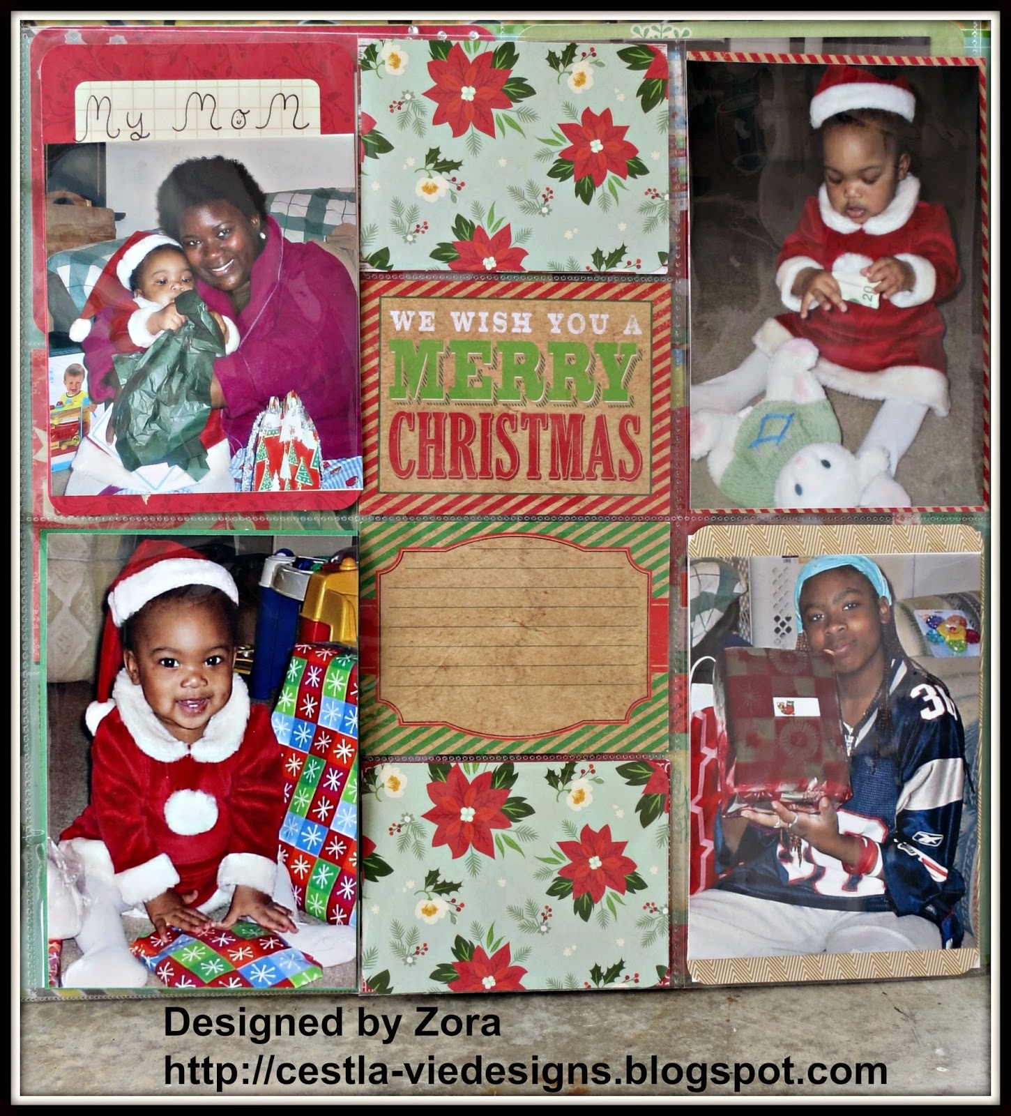
    Here is the last page of Zora's first Christmas featuring grandma and auntie. In these pictures Zora is in the early stages of walking. I love when children are wobbly but determined to get to steppin'! That toy with the mallet and the balls was one of my daughter's favorites! A lot of noise and fun. Those were the days...

    In addition to the Project Life cards and the ones from Paper Studio, Zora created her own card from scratch using can Lawn Fawn cardstock, bling and dimensional embellishments from Jolee's Boutique. I was impressed that she cut out her own snow hills and moon. Awesome, fantastic!


    This girl is on fire.... happy happy, joy joy!

    If you have children in your life what are some of your fav first Christmas memories?

    Thanks for stopping by! Next time I will have 2 more wonderful pages to share from Zora's 2nd Christmas.

    La-Vie

    Thursday, October 16, 2014

    Pocket Scrapbooking for Christmas


    Greetings! Continuing from last post here are pages two and three of the Christmas album my darling daughter is creating. If you missed it, please click here to see page 1.


    Zora was really getting into it this time around. I think she really got over her 'scrapbooking is hard/boring and time consuming' phase. She found her stride and was able to make decisions a lot quicker.


    In the upper left hand corner, she layered a large and small journaling card with a pine cone sticker to create the perfect backdrop for her picture. Next door she combined a clear sticker and chipboard sticker to personalize the journaling card. I love how she was unafraid to layer a sticker on top of the picture to create the desired effect.


    On this next page she used her own cute handwriting to title the picture in the top left. That empty journaling block will allow our family to add their memories as well. This really has become a pleasurable experience and I can let her play without much input. It works well for us both.

    Do you craft with your kids? What do you usually make?  Inquiring minds want to know!

    Thanks for stopping by! Stay tuned for the next installment!


    La-Vie

    Tuesday, October 14, 2014

    Our Christmas Holidays Together (Pocket Scrapbooking)


    My 9-year-old daughter and I have been working on a special Christmas gift for grandma. We envisioned a Christmas album of all the holidays we have spent together since my children were born. It would be an album we add on to each year.

    I was excited to share the art of traditional scrapbooking with my daughter and yada yada. Well after completing our first page (click here to see what she created) she complained how slow the process is and how she wasn't enjoying herself "at all." HEARTBROKEN and sullen I put away all the stuff and tried to come up with a better way.

    Then I remembered my hubby bought me a pocket scrapbooking kit from Mambi Me & My Big Ideas for my birthday and I had put it up on the shelf. I had not yet gotten into pocket scrapbooking and wasn't sure how I felt about it. It's fast but is it cheating? Will I enjoy it as much as creating a traditional page? Inquiring minds want to know...

    But alas... I figured out a child will definitely respond to pocket scrapbooking. It's fast and there's less decisions to make. No Cricut needed. I already had the ones from Mambi, so I went out and bought various sizes of Christmas and family themed Project Life cards and ones by other companies such as The Paper Studio.

    In the beginning Zora created this one page and was EXHAUSTED. I am proud of her for journaling and using her creativity to cut out shapes and layer them to create her own embellishments and such. In the next few posts I will share more of the album as it develops. Whatever we get done by Christmas will be the gift. It's a work in progress. Unbreak my heart... my girl IS a scrapbooker!!

    How do you feel about pocket scrapbooking? If you do it, let me know wzup! What do you document  using this type of scrapbooking? Where can I find all the best supplies?

    La-Vie

    Thursday, October 9, 2014

    It's my Haul Y'all - Scrapbook Expo Sept. 2014


    I am experimenting with making videos for YouTube. Bare with me as I learn and continue to improve. I'd love it if you follow me on YouTube. Thanks for stopping by!!

    La-Vie

    Sunday, October 5, 2014

    DCWV and Prima Doll 4th Grade Back to School Layout


    Today I completed a scrapbook layout of my daughter's first day of school. I was inspired by a Page Maps sketch, a Julie Nutting Prima Dolls stamp and the Die Cuts With A View (DCWV) Edumacation Stack. 

    Here's the Prima Doll Copic-colored and styled to match my daughter's American Girl outfit; which in turn matches the outfit her American Girl doll Cecile is wearing.


    And here's the whole layout.


    Supplies:
    • DCWV - The timeless type stack, The Edumacation Stack
    • Julie Nutting Prima Doll stamp
    • Stamps of Life - branches4flowers
    • Tim Holtz Grid Blocks
    • Copics - 0, 100, C: 1, 3, 5, 7, 9   E: 13, 15 
    • Xyron sticker maker 1" and 2.5"
    • Memento ink - Tangelo, Tuxedo Black, Bahama Blue, Bamboo Leaves
    • Copic Mutliliners - 0.3 black, 0.5 red, 0.5 blue
    • Copic X-press it blending card
    • Scotch ATG
    • Sharpie extra-fine point metallic gold paint pen
    • Martha Stewart scallop dot punch
    • Reminisce Making the Grade - 4th grade and Kindergarten dimensional stickers
    • Mary Engelbreit Scrapbook Stickers by Creative Imaginations - apples, School Days 
    • American Crafts Thickers - Paperback patterned fabric letters stickers
    • Scrapbook Page Maps by Becky Fleck - 12x12 layout: 4 photo sketch 


    The first page features 4 patterns of cardstock from DCWV Edumacation stack and a collage of stickers from Creative Imaginations and Reminisce to create a striking title.


    The second scrapbook page shows my daughter alongside the Prima Doll and her American Girl doll.     To mimic the tulle flowers on her skirt, I stamped a tiny flower image from The Stamps of Life onto the Prima Doll's skirt. An extra-fine point Sharpie metallic gold paint pen was used to create the necklace.


    This is my daughter's last year of elementary school so it's an important year for her. Big girl on campus so to speak... she has many clubs and activities that are now available to her. And this is the first year she can play an instrument. She has chosen the clarinet. I will definitely document all these experiences.

    I hope to you enjoyed this presentation! I'd love to hear what you think of my work. Thanks so much!

    La-Vie

    Challenges: